This project appeared on the website of the German news magazine Der SPIEGEL and was built with the team of their graphics desk.
Well-known data in a different format
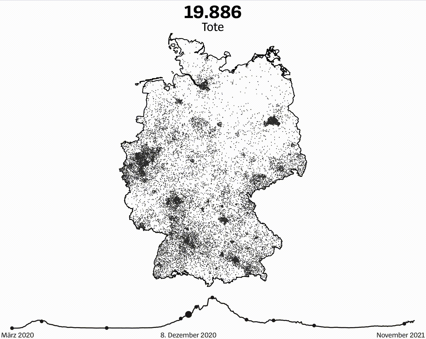
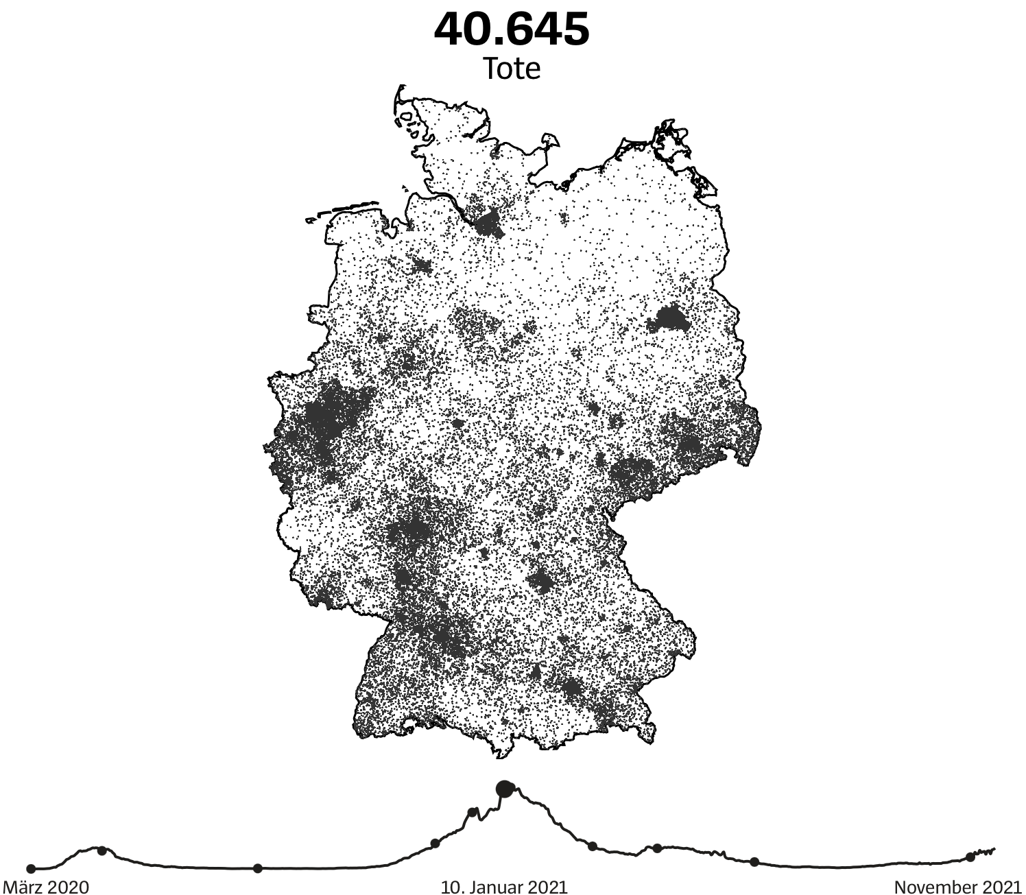
In the end of November 2021, German health authorities registered the 100,000th dead person as a consequence of the ongoing Covid-19 pandemic. On the occasion of this sad landmark, we created a map of Germany showing every death by the location where it has been registered.
Scroll through time
The deaths are not shown at once. Instead, viewers are encouraged to scroll through time from March 2020 until winter 2021 while seeing more and more deaths burning as little dots into their screens. Eventually, to complete the rather emotional setting, we added short stories underpinned with fitting photos.
Technical challenges
After we sketched the first ideas for this visual story, it became clear that we have to plot tens of thousands of dots on our readers’ screen. If this also happens dynamically based on the browser’s scroll event, the dots have to be drawn with WebGL. Here, we developed custom shader code and built it in with the help of the low-level WebGL framework Regl.
The team
Matthias Stahl: Data visualization design and coding
Dawood Ohdah: Coding
Bernhard Riedmann: Research
Explore the project