This project appeared on the website of the German news magazine Der SPIEGEL and was built with the team of their graphics desk.
The circle of geniuses
The Nobel Prize has been awarded since 1901. How strongly are women represented? Who were the youngest and oldest winners? And where is the best place to do research? To answer these and more questions, we designed a unique data visualization.
Showing statistics and individuals
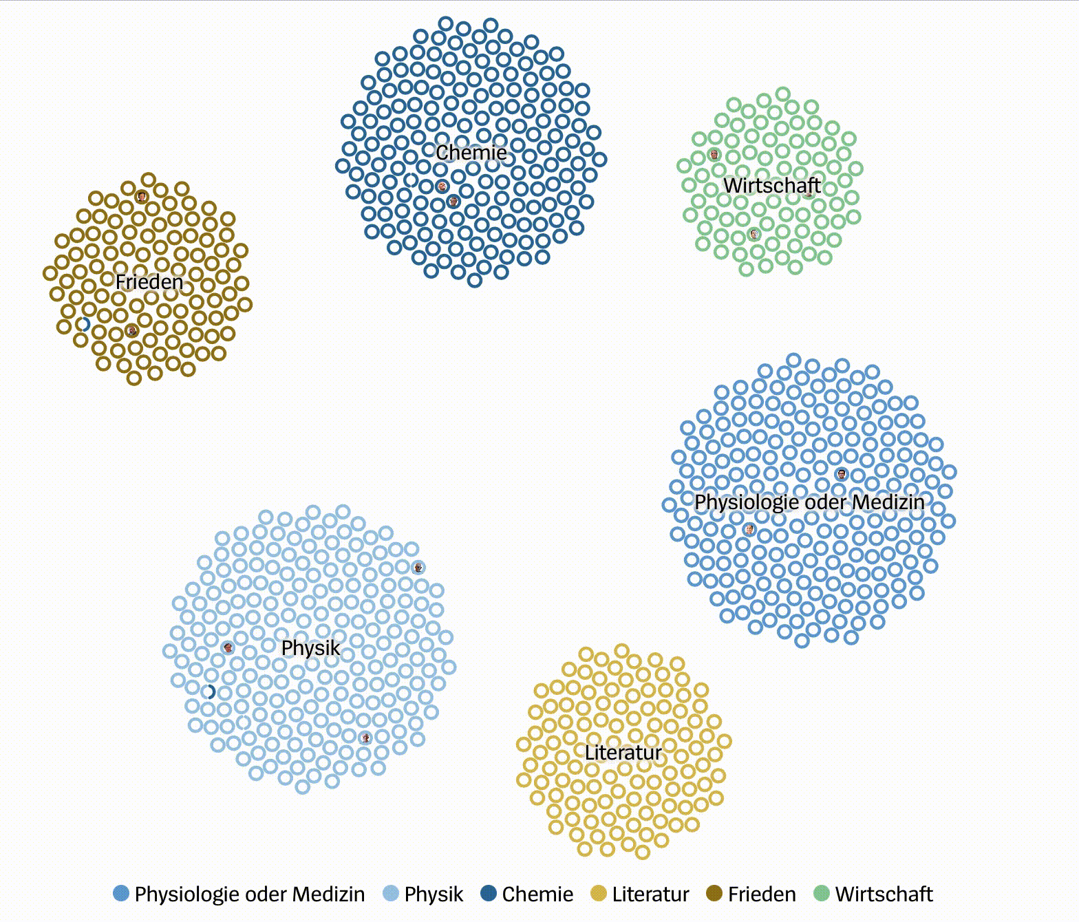
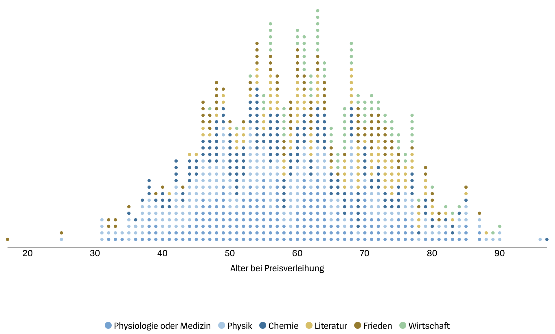
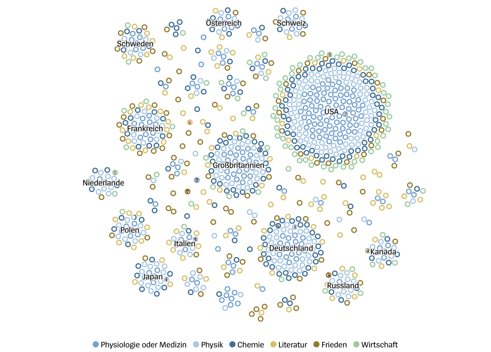
By showing a colored circle for each Nobel Laureate, both general statistics, such as the research areas of the laureates, and individual, person-related stories can be told. We use the individual points even to constitute well-known chart types, such as age histograms.
Transitions for easier readability
One of the crucial parts when developing this visual story were smooth transitions between the different chapters. Thereby readers can easily follow the storyline and readily relate the different data representations to each other.
The team
Matthias Stahl: Data visualization design and coding
Alexander Epp: Story
Explore the project