🏆 Shortlisted for the Information Is Beautiful Award 2022, Humanitarian Category.
🏆 Featured in Andy Kirk’s Best of Data Visualisations in June 2021 list.
🖥 The code for this project has been published on GitHub.
A data set of persecuted people
When I started my data visualization studio, I always wanted to work in these three areas: public health, climate change, and human rights & democracy. In late 2020 I got in contact with the organization Journalism Is not a Crime. They document human rights abuses of professional and citizen journalists in Iran and have assembled a dedicated data set of more than 700 people. Although this database contained a wealth of information, it was hard to access the actual information.
The challenge
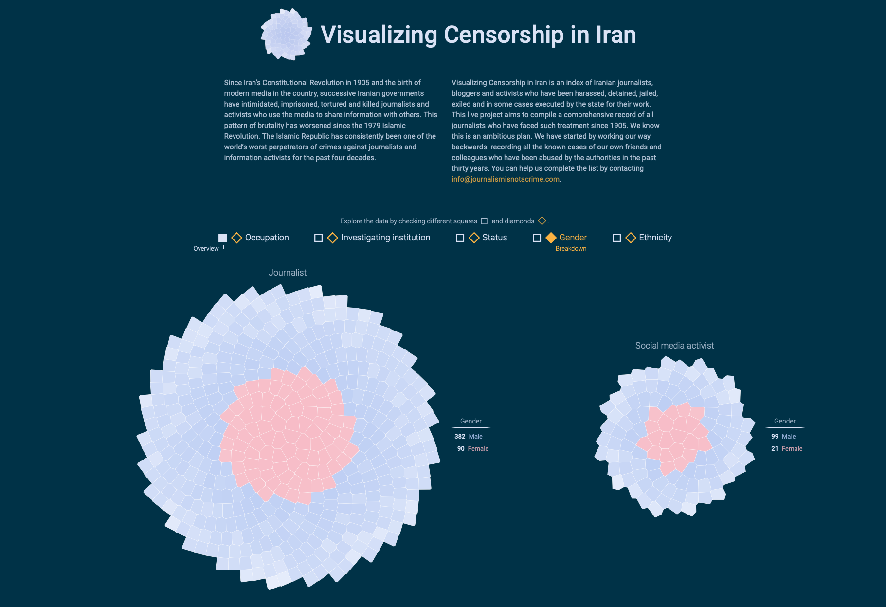
I was overwhelmed by the number of journalists in the data set and also touched by the individual biographies of each and every person. In the following weeks I came up with a visualization design that should fulfill two goals: (i) Visualizing all the people at once to demonstrate how many they are, and (ii) letting people dive deeper into the individual stories that were hidden behind each record.
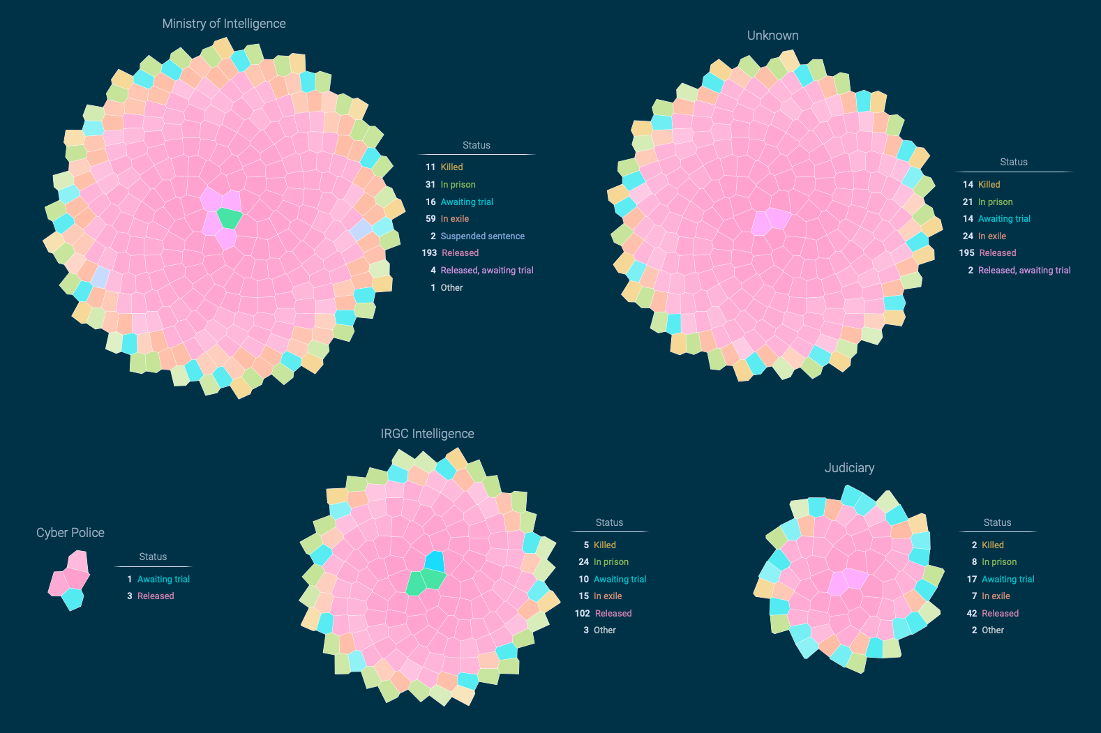
It was relatively clear to me that I need to show all people at once as a starting point. Then there should be an easy way how to explore individual people. In addition, Journalism Is not a Crime also collected qualitative data about each person: gender, status, occupation and much more. I had to find a way how people can group and order journalists by these variables.
(And – as a side note – the visualization should appear in English and Persian.)
Inspiration from Persian architecture
I spent a whole afternoon walking around in my neighborhood. Usually, I get the best ideas when I am out in nature. I thought all of the journalists in the data set do their job because they love their country. They are even willing to risk their lives for it. I tried to imagine what they might be proud of. So I came up with the stunning ancient Persian architecture. What if I visualize these brave people as tiles in a mosaic picture? From there, the rest of the design was straight forward.
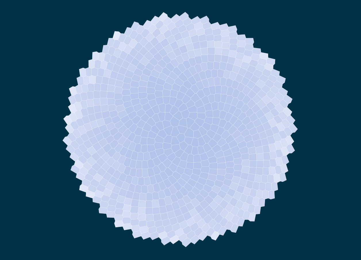
I created one big rosette built up of tiles. Each tile represents a journalist. Shape and color of each tile are unique – similar to the real historic buildings and, of course, because each journalist and their associated story is unique. A simple control panel would allow for different rosette groupings and tile colors based on the data variables. For instance, tiles (journalists) can be grouped by occupation and colored by gender.
Hovering over the tiles triggers a small tooltip with peronal information about the respective journalist. This is the moment when the viewer realizes that each tile is actually a real person. Eventually, clicking on the tile opens up the biography of the selected journalist.
Technical details
Each data visualization project has two major challenges: Design and code. Having the design wrapped up, I selected Svelte as frontend framework in combination with D3 and the HTML Canvas technology.
I am an absolute ambassador of Svelte for data visualization. It comes with priceless features such as easy boundary detection, smart and efficient transitions, and: renderless components. Shout out to Tan Li Hau, who made me familiar with this concept. It makes it possible to write declarative code when working with Canvas. Probably, it’s all Greek to you, but this little feature makes coding very intuitive.
You might wonder why I have chosen Canvas over SVG at all. It’s just a question of performance. When moving around 700+ tiles, SVG with it’s DOM nodes is too slow.
In order to create the rosette layouts, I got inspired by this fantastic Observable notebook by Benjamin Schmidt, based on work by Philippe Rivière. Although I coded the tiles in a different way, it made me familiar with the concepts of a combined phyllotaxis/Voronoi layout.