ℹ️ This visualization is part of a series by five designers. Check out the whole gallery.
🖥 The code for this project has been published on GitHub.
A tribute to Stockholm
I lived in Stockholm from 2018 through 2020. I love the city with its small cafés, the million lovely places at the waterside, and the welcoming people.
Although I have since moved back to Germany, I am still connected to Stockholm. The Swedish culture and the Swedish way of designing things has always been an inspirational source for a lot of my projects.
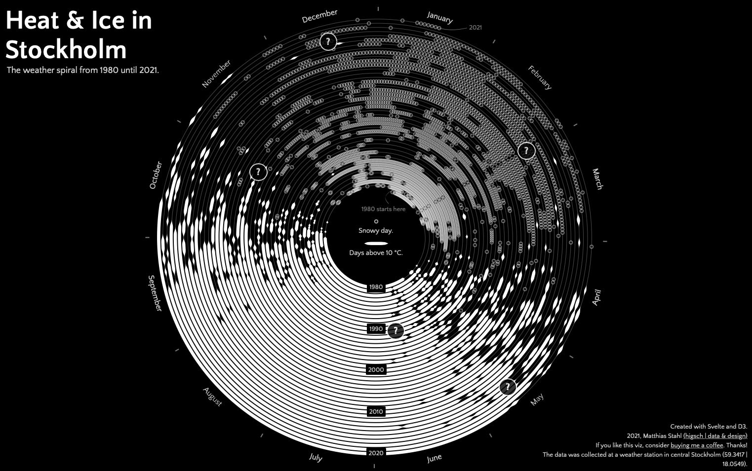
So I was really happy, when the Stockholm Data Visualization meetup community started a small challenge. The goal was to create a data visualization using a huge dataset with temperature and snow height data in Stockholm – starting in the 1850s and going all the way up until today.
The decisions
The challenge had a restriction: the visualization had to be black and white. I decided to convert the data into a black-and-white format by turning the continuous temperatures and snow heights into yes/no categorical variables. So each temperature above 10 degrees Celsius became a hot day (yes, that’s almost warm enough to go for a swim in the sea). Similarly, I transformed the snow heights in “there is snow vs. there is no snow”.
I intended to display multiple years from the dataset – if not all. Just recently, I have become captivated in Yuri Vishnevsky‘s work on Wikipedia metadata. He arranged a multi-year timeline as a spiral, which enables an easy comparison of same seasons across all the years.
I decided to encode the hot vs. cold days with a thicker spiral line and the snowy days as circles. This just seemed to be the easiest encoding possible and should facilitate the decoding of the full spiral visualization.
The building
If you know me, you know that I love interactive visualizations and I love using Svelte for the coding part.

After doing all the spiral work, I also liked to add a snowing animation in a way that all the snowy day circles fall as snowflakes from the top to their final positions on the spiral. Luckily, just a few days before the challenge closed Li Hau showed us on YouTube how to use renderless components for drawings on HTML canvas. It turned out to be super useful for the implementation of the snowflakes on canvas.

Eventually, I restricted the dataset to the last 40 years. More spiral rounds would have been possible, but were not readable any more. Also I thought it might make sense to just focus on the data from times that most of us have lived in.
The last tiny bit was the addition of some outlier explanations. As this is an interactive piece, I made use of simple tooltips that can be triggered by hovering over one of the question marks.