🏆 This design work was featured in Andy Kirk’s Best of Data Visualisations in September 2020 list.
🖥 The code for this project has been published on GitHub.
🖋 The story was originally published in Nightingale, the journal of the Data Visualization Society.
It was the moment before we even realized how much the world, as we knew it, would change completely.
In early 2020 I took some time for myself, sat down on my couch, and reflected on the work I was doing. It had been two years since I started my postdoctoral training as a bioinformatician — a data scientist for biology — at Karolinska Institutet in Stockholm. Until that point, I worked my entire professional life in the field of medicine. At the beginning of my career, this made sense in the ongoing effort to make the world a better place. For years, I was under the impression that this was the best way for me to lend my skills to the betterment of society.
But now, we were on the cusp of a pandemic; a time rife with conspiracy theories and the distribution of false information. The potential for long-standing democracies to crumble quickly became a reality.
I doubted myself.
Am I on the right track? Is my work in the medical field enough? Could I do more?
Perhaps.
As my passion and knowledge in data visualization grew, I realized that the skills and tools I used in my work with cancer research could easily be implemented into many other fields of data analyses; particularly projects relating to pro-democracy. With this in mind, I made the decision to launch my career as data visualization designer later in the summer.
Foreign Interference
Only ten days later, I was in contact with the Digital Forensic Research Lab (DFRLab) at the Atlantic Council in Washington D.C. They were about to publish a dataset on foreign interference in the United States’ presidential election. It consisted of around 50 foreign interference attempts starting in late 2018. The team at the DFRLab has focused on the case attributions and their echo in social media rather than on the cases themselves. Hence, for each allegation, they revealed its source and quantified the respective social media impact for one week upon the allegation had been published.
As Emerson T. Brooking, DFRLab’s team lead, presented the data to me, I silently counted the dimensions: time of attribution, nation of origin, social media impact (split up in Facebook, Twitter, and Reddit), dates of activity, more metadata and also a score, which the DFRLab developed, to be able to estimate the “case attribution confidence”.
How I Built The Balloon Viz
I started off by sketching out some ideas of what the timeline could potentially look like. I quickly realized it would be best to switch to using real data as I couldn’t be sure as to how the cases would end up being distributed in the first place.
I set up a new web development project with Svelte — an attractive alternative to the popular frontend frameworks React and Vue. There wasn’t much of a learning curve and it was filled with a lot of coding tools, optimized for the dataviz community. I knew that this was going to be a complex project and I was curious to apply some of Svelte’s built-in transitions and actions. (A very grateful shout-out to Brooking who granted me full artistic freedom and free choice of technologies.)
But when the case time points appeared on a horizontal timeline in my browser, I was disappointed. Unfortunately, many cases had a similar attribution date leading to over-crowded segments. A zoomed-in view of the timeline could have been helpful, but at this stage I wanted the user to have one, overarching view of the dataset at first glance. I needed to find a different way to present the timeline.
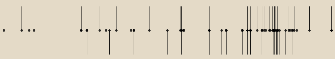
My first attempt to plot foreign interference cases by their attribution date from left to right. In order to get a sense of how clustered the data points are, I attached alternating vertical lines to each event.
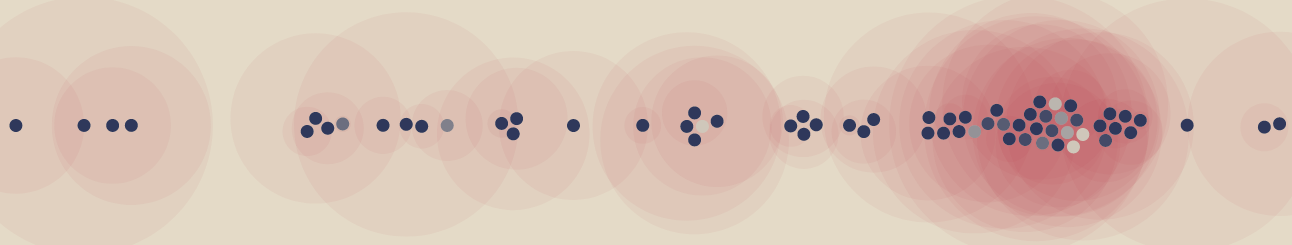
Shirley Wu‘s 655 Frustrations Doing Data Visualization came to mind. She had visualized answers to a community survey; laid out as little circles on a horizontal scale. More importantly, she packed these circles with D3‘s force simulation capabilities. I redesigned my computational sketch based on Wu’s beeswarm model.

Declustering circles with D3's force simulation and collision prevention. The shades of blue already represent the case's attribution score. A measure for the confidence in the reporting of each respective case.
Finally, I was able to depict all foreign interference cases clearly on the timeline.
Social Media Impact
With the timeline done, I experimented with using the circles’ fill color to display the case attribution confidence score. It was now time to bring in a new dimension: social media impact. This would be a number from zero to some millions, counting the engagements and shares on several social media channels.
Adding social media coverage encoded as transparent red circles around each case. It reminded me of a map of impacts — an analogy which isn't too bad. However, readability was strikingly limited.
Drawing circles with radii relative to the social media impact was not a particularly revolutionary idea. It seemed like it would be difficult for a user to compare the red circle sizes in the dense cluster region with each other. It also didn’t look like it would be easy to connect each social media circle with its associated case circle.
The effects of sleep deprivation came and went as I worked through the night, trying to figure out how to solve this issue. Suddenly, my thoughts jolted me back to an alert state as I figured out what needed to be done. I would just need to lift the social media impact to a new vertical dimension and use a simple line to point out the attribution date on the timeline. Whew!
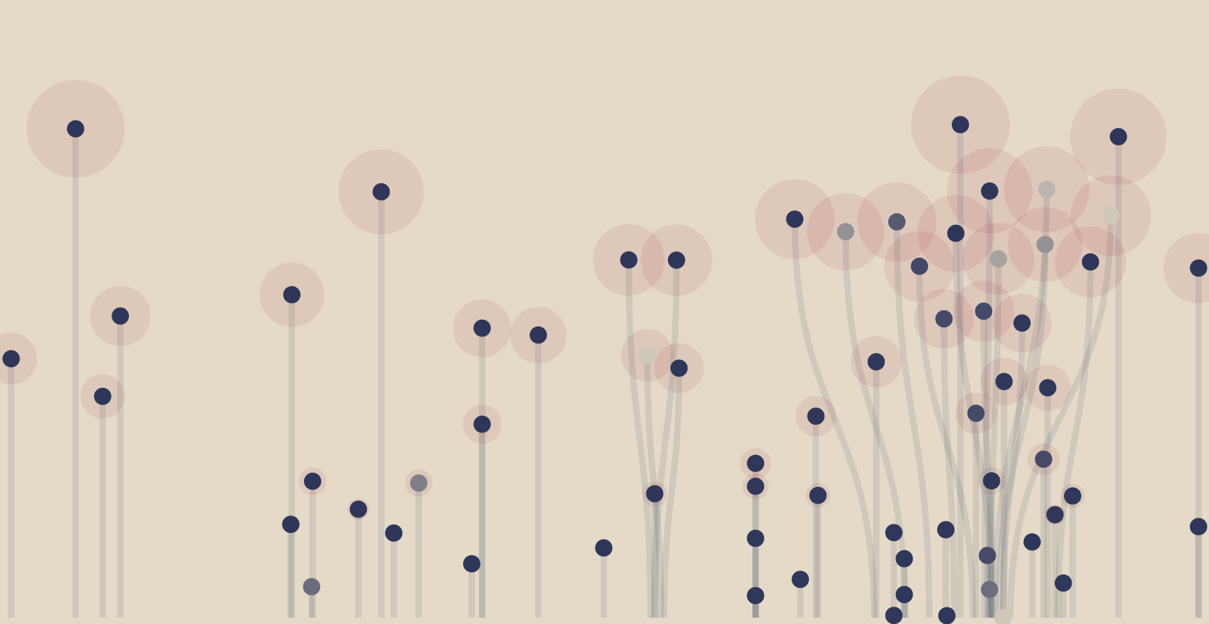
Separating the social media impact from the timeline led to an interesting arrangement of the events into a vernal flower field. While this was visually appealing, I felt uncomfortable with the analogy. Foreign interference attacks as a blooming field?
The circles were still part of a force layout. I fixed their vertical position to the corresponding social media impact and sized the red shadows according to this variable.
I wasn’t completely happy with the double encoding, but I kept it.
Design Edits
I accidentally produced a pretty field of flowers. This seemed a bit backwards. Typically, one would think of a tailored analogy first and then go on to apply it to the data to create an appealing design. I wasn’t a huge fan of the flowers, so I looked at other options for shapes.
I tried using flames as I could implement color shades to illustrate the different social media channels.
I liked it a lot.
My client, however, didn’t.
To be honest, I appreciate the openness of the DFRLab team. In hindsight, I understand that the flames are hard to interpret and would have distracted the reader from the actual message. Having said that, the flames could have been the perfect analogy for foreign interference attacks and allegations burning through social media timelines.
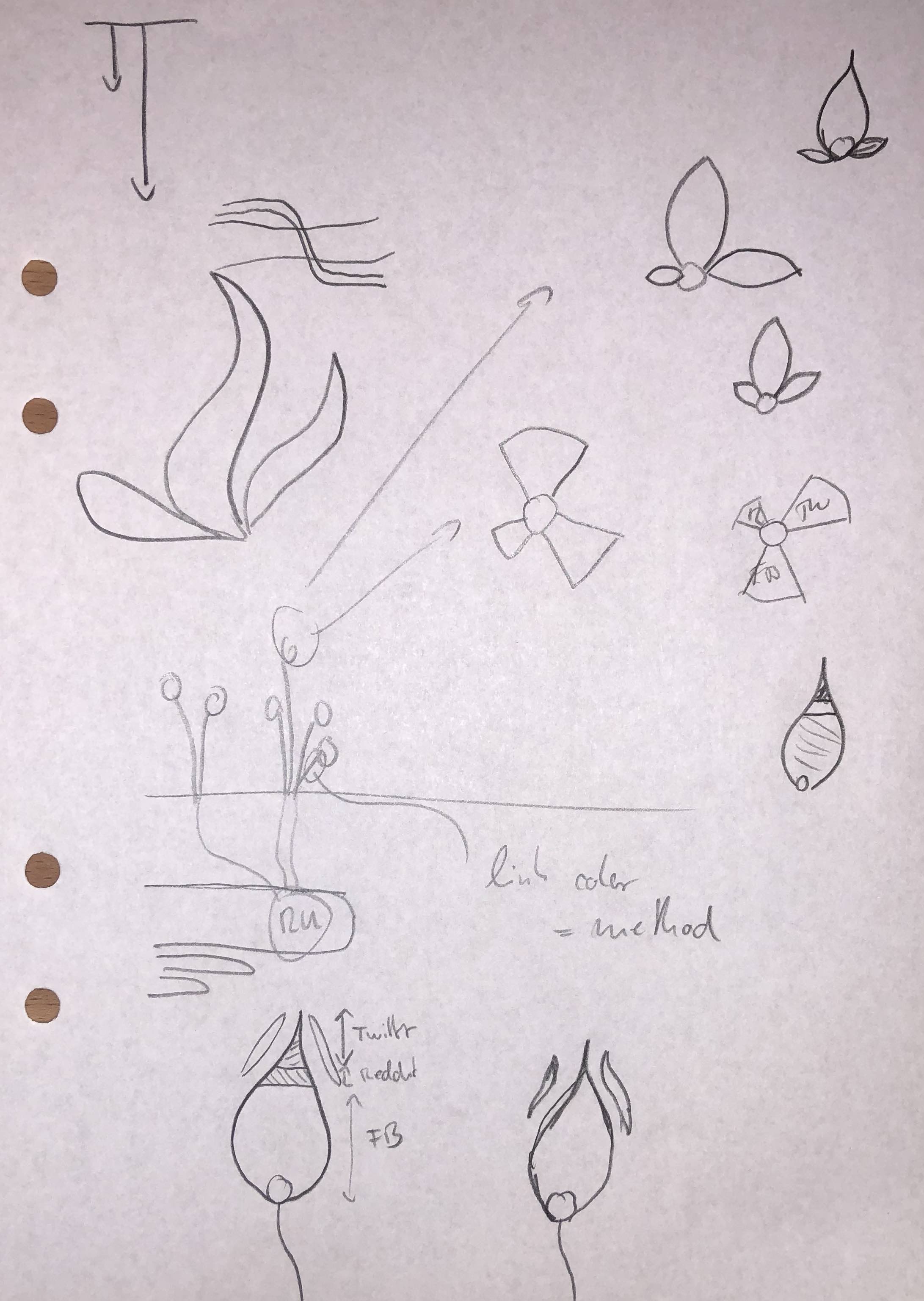
Exploring alternative shapes for the social media impact encoding. A blank piece of paper and a pencil are the best tools for free and quick design brainstorming.
So I suspended them to an on-demand “flame mode” for the time being (later killing them completely and keeping this last screenshot for a future Nightingale article). You could even say it’s now a “limited-edition” piece of art.

The match cabinet. Turning flowers to flames lit the visualization on fire. Enjoy this screenshot as you will not see these flames in the running visualization.
Still licking my designer wounds, I connected again with the DFRLab. showing them the flowers while expressing my unhappiness about this nonsensical analogy. Brooking, however, didn’t see flowers. He saw balloons. The logic being that balloons were a large part of American celebration culture, particularly during elections.
This, I could definitely work with.
A Wider Range Of Data
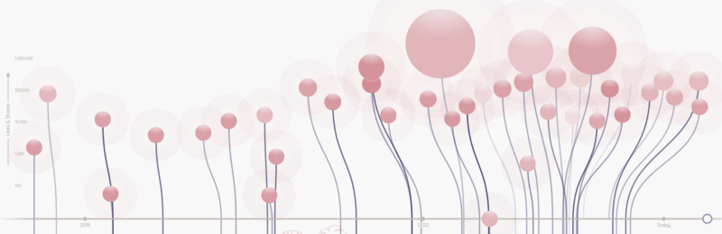
As the project continued, the DFRLab collected more and more foreign interference attributions. It was clear that the range of social media engagement was much wider than initially expected. Soon, we had extreme cases, some scoring over two million in social media impact metric. As you can imagine, this completely broke my current design that utilized a linear vertical axis. However, being a scientist, I simply switched the scale to a logarithmic one. Now all the cases with very high social media impact lined up at the top and it was easier to spot the differences for the low performers.
At the same time, a handful of cases with extraordinarily high social media coverage were still distinguishable by their balloon radius, which were sized according to a square root scale. The double encoding made sense now.
By combining a logarithmic and square-root scale as two different visual encodings, I was able to present the data in a perfectly distributed way. More importantly, it allowed me to draw the users’ attention to the more extreme cases.
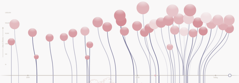
Two logarithmic scales: Social media impact encoded as balloon height and radius. Both in logarithmic scale. Low performing cases are well distinguishable, but extremely high cases cannot be spotted.
A change of the radius scaling to a square-root function. The social media champs can now easily be identified by their enormous balloon radius.
The DFRLab was happy with the timeline presented and suggested a map view; highlighting the nations of origin for each foreign interference claim. I, however, was concerned about providing users with a separate view as it might not yield the most optimized results. A user would have to click back-and-forth between the two tools and in each case would miss out on relevant information.
With a bit of hesitation, I decided to put the map directly below the timeline. This was an experiment that I was not sure would succeed, but once in place, seemed to work well.
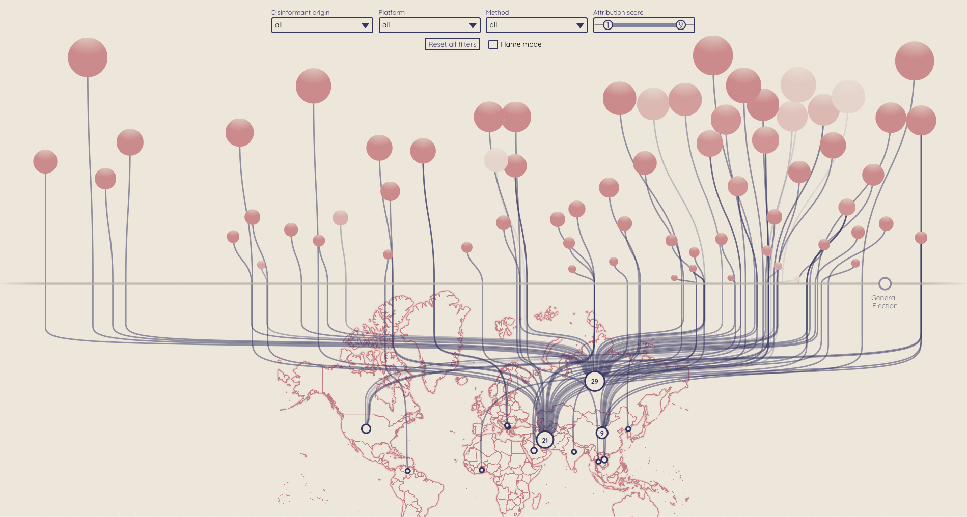
Putting a map just below the timeline opened up the possibility to link the balloons to a country of origin.
The following days were used to implement a number of filters, tooltips, and connected animations (go Svelte, go!). Finally, the interactive dataviz was ready for publication; and just in time for election season!
What I Learned
It took four intense and sleepless weeks to build a data visualization tool that could potentially change the way people see the potential for disinformation as it relates to this upcoming election.
Only half a year ago, I was sitting on my couch, pondering the different ways I could contribute to society outside of the field of medicine. I even wondered if my skills in data visualization would be useful in promoting a more transparent democracy.
Today, as I read through my Twitter feed and see all of the real-time reactions from people around the world, I know that I am making a difference. The impact is tangible through feedback from my peers and strangers on the other side of the globe.
In the end, I merely followed my passion, and I couldn’t have asked for a better result.
Acknowledgement
This design work has been based on the incredible data research of the DFRLab at the Atlantic Council under the guidance of Emerson T. Brooking. Many thanks to Marjorie Perlas, Adam Oxford and the Nightingale team for editing this article.